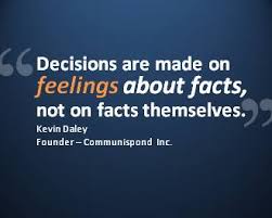
A presentation should not be a document filled with text, it should guide the audience visually while you explain.
Fonts must be readable from a distance, fancy styles often fail on the projector screen.
Too many colors confuse, a limited palette creates harmony.
Images should support the idea, not just decorate the slide.
Each slide should hold one clear message, otherwise people lose track.
Consistent layout gives a professional flow, scattered designs feel distracting.
Animations are helpful only when subtle, overuse looks unpolished.
Data should be shown through charts or visuals, not buried in long paragraphs.
A strong opening slide and a clear closing slide frame the entire presentation.
Always design keeping the audience in mind, not just personal taste.
Keep font size large enough so even the last row can read it without effort.
Use master slides to maintain uniform style across the deck.
Avoid cluttering with too many bullet points, fewer lines are easier to follow.
SmartArt helps convert boring lists into visual formats.
High quality images prevent pixelation when projected on big screens.
Slide transitions should be simple, too many effects make it look amateur.
Charts in PowerPoint should be clean with minimal labels, not overloaded with numbers.
Contrast between background and text must be strong to avoid strain.
Slide numbers help the speaker and audience keep track.
Test the presentation on the same system or projector to ensure compatibility.
Contact Us to make a professional presentation for you.


